Basics
Flexbox is a modern one-dimensional layout method for arranging items in rows or columns.
Syntax:
.parent{
  display: flex;
}
In the flex layout model, the children of a flex container can be laid out in any direction, and can flex their sizes, either growing to fill unused space or shrinking to avoid overflowing the parent.
Example:
After applying
flexto parent
Terminology
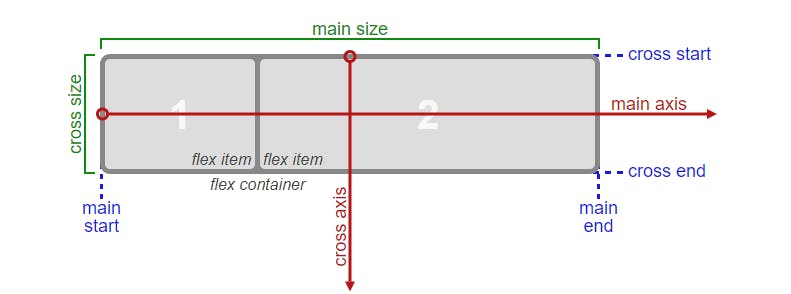
main axis: The main axis of a flex container is the primary axis along which flex items are laid out.
cross axis: The axis perpendicular to the main axis is called the cross axis.
main-start & main-end: The flex items are placed within the container starting on the main-start side and going toward the main-end side.
cross-start & cross-end: Flex lines are filled with items and placed into the container starting on the cross-start side of the flex container and going toward the cross-end side.
main size: A flex item’s width or height, whichever is in the main dimension, is the item’s main size.
cross size: The width or height of a flex item, whichever is in the cross dimension, is the item’s cross size.
Flexbox Properties
Flex direction
The flex-direction property specifies how flex items are placed in the flex container, by setting the direction of the flex container’s main axis.
.parent {
  flex-direction: row (default) | row-reverse | column | column-reverse;
}
- row: The flex container’s
main axishas the same orientation as theinline axisof the current writing mode. Themain-startandmain-enddirections are equivalent to theinline-startandinline-enddirections.

- row-reverse: Same as
row, except themain-startandmain-enddirections are swapped.

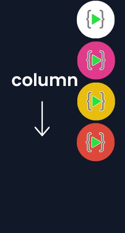
- column: The flex container’s
main axishas the same orientation as the block axis of the current writing mode. Themain-startandmain-enddirections are equivalent to theblock-startandblock-enddirections.
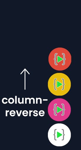
-column-reverse: Same as column, except the main-start and main-end directions are swapped.
Flex wrap
Flex wrap defines wrap the elements in side parent or not.
.parent {
  flex-wrap: nowrap (default) | wrap | wrap-reverse;
}
- nowrap: all flex items will be on one line
- wrap: flex items will wrap onto multiple lines, from top to bottom.
- wrap-reverse: flex items will wrap onto multiple lines from bottom to top.
justify-content
The justify-content property aligns flex items along the main axis of the current line of the flex container.
.parent {
  justify-content: flex-start (default) | flex-end | center | space-between | space-around | space-evenly;
}
- flex-start: items are packed toward the start of the flex-direction.

- flex-end: items are packed toward the end of the flex-direction.

- center: items are centered along the line.

- space-between: items are evenly distributed in the line; first item is on the start line, last item on the end line.

- space-around: items are evenly distributed in the line with equal space around them. Note that visually the spaces aren’t equal, since all the items have equal space on both sides. The first item will have one unit of space against the container edge, but two units of space between the next item because that next item has its own spacing that applies.

- space-evenly: items are distributed so that the spacing between any two items (and the space to the edges) is equal.

align-items
The align-items property aligns flex items along the cross axis of the current line of the flex container.
.parent {
  align-items: stretch (default) | flex-start | flex-end | center | baseline | first baseline | last baseline | start | end;
}
stretch: Flex items are stretched such that the cross-size of the item's margin box is the same as the line while respecting width and height constraints.
start | flex-start: The cross-start margin edges of the flex items are flushed with the cross-start edge of the line.
baseline | first baselineItems are aligned on the start of baseline.

end | flex-end: The cross-end margin edges of the flex items are flushed with the cross-end edge of the line.
last baseline: Items are aligned on the end of baseline.
Currently only supported on firefox.

- center: The flex items' margin boxes are centered within the line on the cross-axis. If the cross-size of an item is larger than the flex container, it will overflow equally in both directions.

align-content
The align-content property sets the distribution of space between and around content items along a flexbox's cross-axis.
.parent {
  align-content: flex-start (default) | flex-end | center | space-between | space-around | space-evenly;
}
- flex-start: The items are packed flush to each other against the edge of the alignment container depending on the flex container's cross-start side.

- flex-end: The items are packed flush to each other against the edge of the alignment container depending on the flex container's cross-end side.

- center: The items are packed flush to each other in the center of the alignment container along the cross axis.

- space-between: The items are evenly distributed within the alignment container along the cross axis. The spacing between each pair of adjacent items is the same.
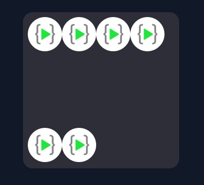
- space-around: The items are evenly distributed within the alignment container along the cross axis. The spacing between each pair of adjacent items is the same. The empty space before the first and after the last item equals half of the space between each pair of adjacent items.

- space-evenly: The items are evenly distributed within the alignment container along the cross axis. The spacing between each pair of adjacent items, the start edge and the first item, and the end edge and the last item, are all exactly the same.
gap
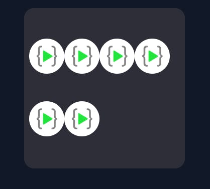
The gap property explicitly controls the space between flex items.
.parent{
  gap : <'row-gap'> <'column-gap'>;
}
Example:
 .parent {
        display: flex;
        gap: 30px;
}

flex-grow
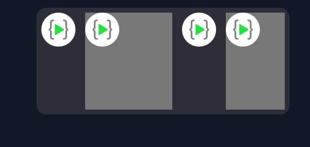
The flex-grow CSS property sets the flex grow factor of a flex item's main size.
default value of flex-grow is 0.
Example:
.child:nth-child(2) {
        flex-grow: 1.5;
        background-color: #777;
      }
.child:nth-child(4) {
        flex-grow: 0.7;
        background-color: #777;
      }
.parent {
        display: flex;
        gap: 20px;
}
flex-shrink
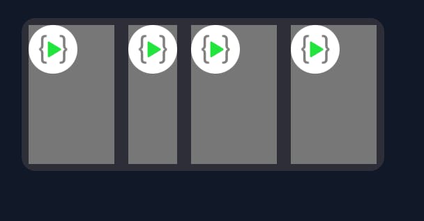
The flex-shrink CSS property sets the flex shrink factor of a flex item. If the size of all flex items is larger than the flex container, items shrink to fit according to flex-shrink.
default value of flex-shrink is 1.
Example:
.child:nth-child(2) {
        flex-shrink: 2;
      }
.child{
        flex-shrink: 1;
        background-color: #777;
      }
.parent {
        display: flex;
        gap: 20px;
}
order
The order property sets the order to lay out an item in a flex container. Items in a container are sorted by ascending order value and then by their source code order.
default value of order is 0.
Example:
default layout

After adding a higher order value
.child:nth-of-type(2) {
        order: 1;
}

Similarly, after adding lower order value
.child:nth-of-type(2) {
        order: -2;
}

align-self
The align-self CSS property overrides a flex item's align-items value.
.parent {
  align-self: auto (default) | flex-start | flex-end | center | baseline | stretch;
}
- auto: Computes to the parent's align-items value.
- normal: For flex items, the keyword behaves as stretch.
- stretch: If the combined size of the items along the cross axis is less than the size of the alignment container and the item is auto-sized, its size is increased equally (not proportionally), while still respecting the constraints imposed by max-height/max-width (or equivalent functionality), so that the combined size of all auto-sized items exactly fills the alignment container along the cross axis.
Example:
.child:nth-of-type(2) {
        align-self: stretch;
}

- self-start: Aligns the items to be flush with the edge of the alignment container corresponding to the item's start side in the cross axis.
flex-start: The cross-start margin edge of the flex item is flushed with the cross-start edge of the line.
baseline | first baseline: Aligns the alignment baseline of the box's first baseline set with the corresponding baseline in the shared first baseline set of all the boxes in its baseline-sharing group.
Example:
.child:nth-of-type(2) {
        align-self: flex-start;
}

- center: The flex item's margin box is centered within the line on the cross-axis. If the cross-size of the item is larger than the flex container, it will overflow equally in both directions.
Example:
.child:nth-of-type(2) {
        align-self: center;
}

- last baseline: Aligns the alignment baseline of the box's last baseline set with the corresponding baseline in the shared last baseline set of all the boxes in its baseline-sharing group.
Currently only supported on firefox.
- self-end: Aligns the items to be flush with the edge of the alignment container corresponding to the item's end side in the cross axis.
- flex-end: The cross-end margin edge of the flex item is flushed with the cross-end edge of the line.
Example:
.child:nth-of-type(2) {
        align-self: flex-end;
}
