


CSS Position
The position CSS property sets how an element is positioned in a document. It defines the position behavior of the element.
Types of position
- static
- relative
- absolute
- fixed
- sticky
Syntax:
position: static;
position: relative;
position: absolute;
position: fixed;
position: sticky;
Notes
- Initial value: * static
- Applies to: * all elements except table-column-group and table-column
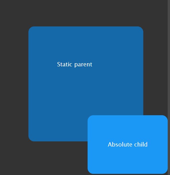
static
The default value static is positioned according to the normal flow of the document. The top, right, bottom, left, and z-index properties have no effect.
Example:
html
 <div class="static">
      <p>Static parent</p>
      <div class="absolute">
        <p>Absolute child</p>
      </div>
    </div>
css
     .static {
         height: 300px;
          width: 300px;
          background-color: #0091ff94;
     }
     .absolute {
          position: absolute;
          bottom: 0;
          right: 0;
          padding: 20px 20px;
          background-color: #1b97f5;
     }
Result
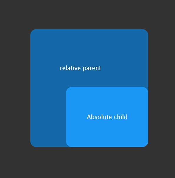
relative
The element is positioned according to the normal flow of the document.
The property relative to itself based on the values of
top,right,bottom, andleft. The offset does not affect the position of any other elements; thus, the space given for the element in the page layout is the same as if position were static.
Example:
html
 <div class="relative">
      <p>relative parent</p>
      <div class="absolute">
        <p>Absolute child</p>
      </div>
css
     .relative {
        position: relative;
        height: 300px;
        width: 300px;
        background-color: #0091ff94;
      }
      .absolute {
        position: absolute;
        bottom: 0;
        right: 0;
        padding: 20px 20px;
        background-color: #1b97f5;
      }
Result
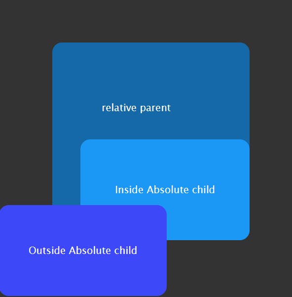
absolute
The element is removed from the normal document flow, and no space is created for the element in the page layout.
It is positioned relative to its closest positioned ancestor, if any; otherwise, it is placed relative to the initial containing block. Its final position is determined by the values of
top,right,bottom, andleft.
Example:
html
 <div class="relative">
      <p>relative parent</p>
      <div class="inside-absolute">
        <p>Inside Absolute child</p>
      </div>
    </div>
    <div class="outside-absolute">
      <p>Outside Absolute child</p>
    </div>
css
     .relative {
        position: relative;
        height: 300px;
        width: 300px;
        background-color: #0091ff94;
      }
      .inside-absolute {
        position: absolute;
        bottom: 0;
        right: 0;
        padding: 20px 20px;
        background-color: #1b97f5;
      }
      .outside-absolute {
        position: absolute;
        bottom: 0;
        left: 0;
        padding: 10px 10px;
        background-color: #3d49f8;
      }
Result
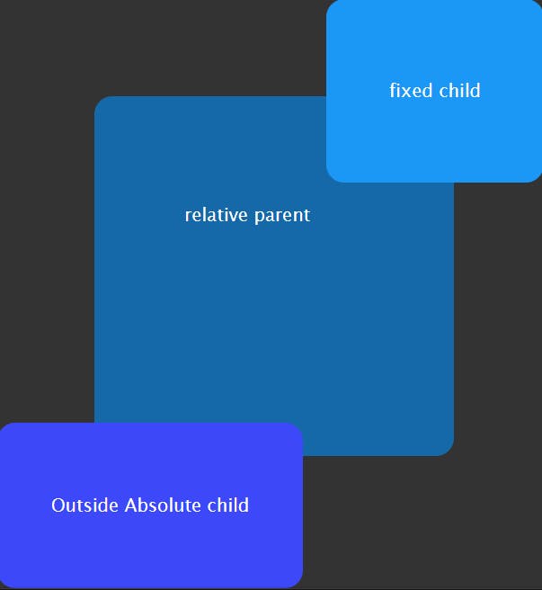
fixed
The element will not remain in the natural flow of the page. It will position itself according to the viewport.
The final position itself based on the values of
top,right,bottom, andleft.There are browser inconsistencies with
perspectiveandfiltercontributing to containing block formation.
Example:
html
<div class="relative">
      <p>relative parent</p>
      <div class="fixed">
        <p>fixed child</p>
      </div>
    </div>
    <div class="outside-absolute">
      <p>Outside Absolute child</p>
    </div>
css
.relative {
        position: relative;
        height: 300px;
        width: 300px;
        background-color: #0091ff94;
      }
      .fixed {
        position: fixed;
        top: 0;
        right: 0;
        padding: 20px 20px;
        background-color: #1b97f5;
      }
      .outside-absolute {
        position: absolute;
        bottom: 0;
        left: 0;
        padding: 10px 10px;
        background-color: #3d49f8;
      }
Result
sticky
The element is positioned according to the normal flow of the document, and then offset relative to its nearest scrolling ancestor and containing block (nearest block-level ancestor), including table-related elements, based on the values of top, right, bottom, and left.
Example:
html
css
Result